Bomboloni
Branding Design
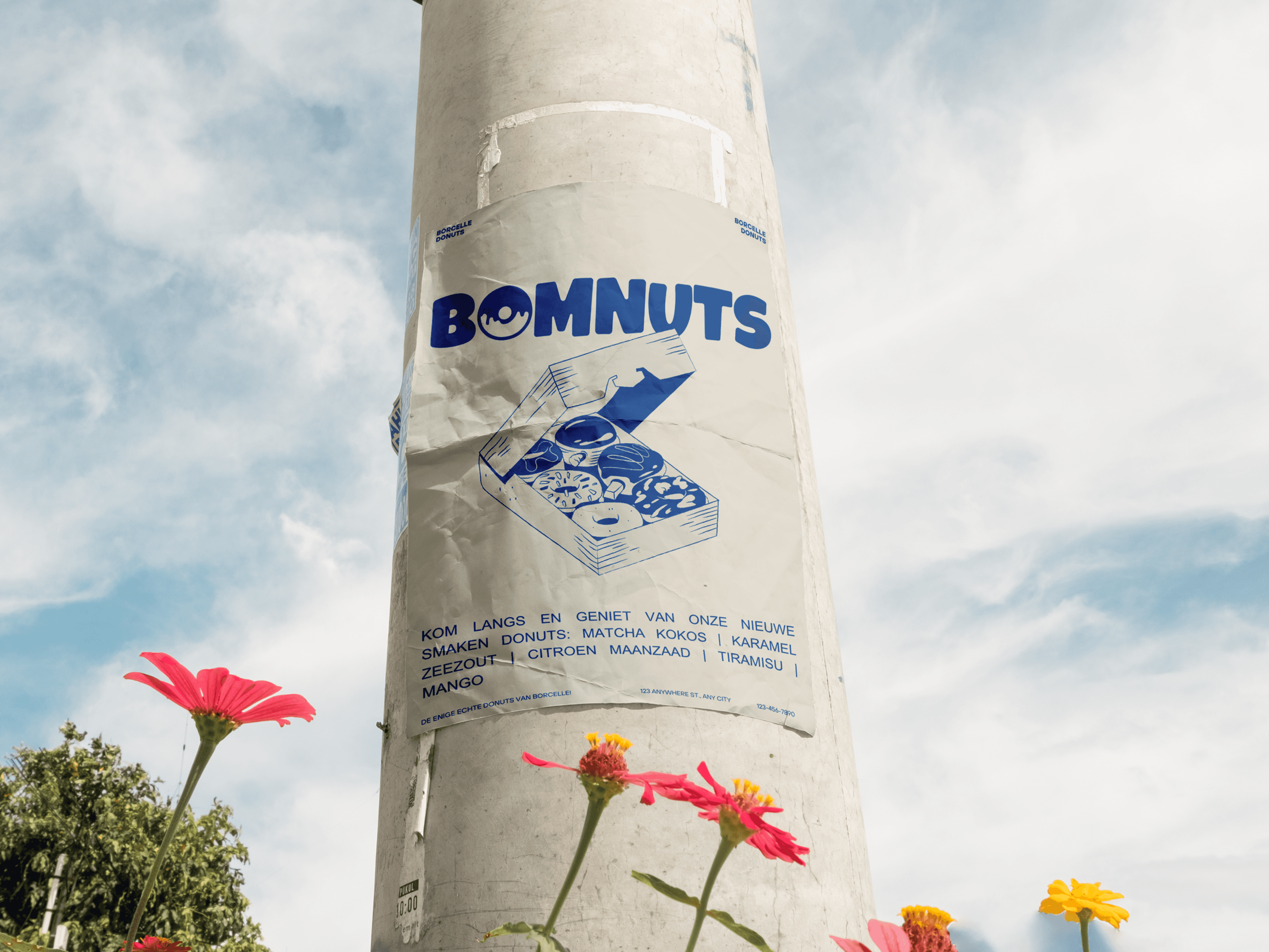
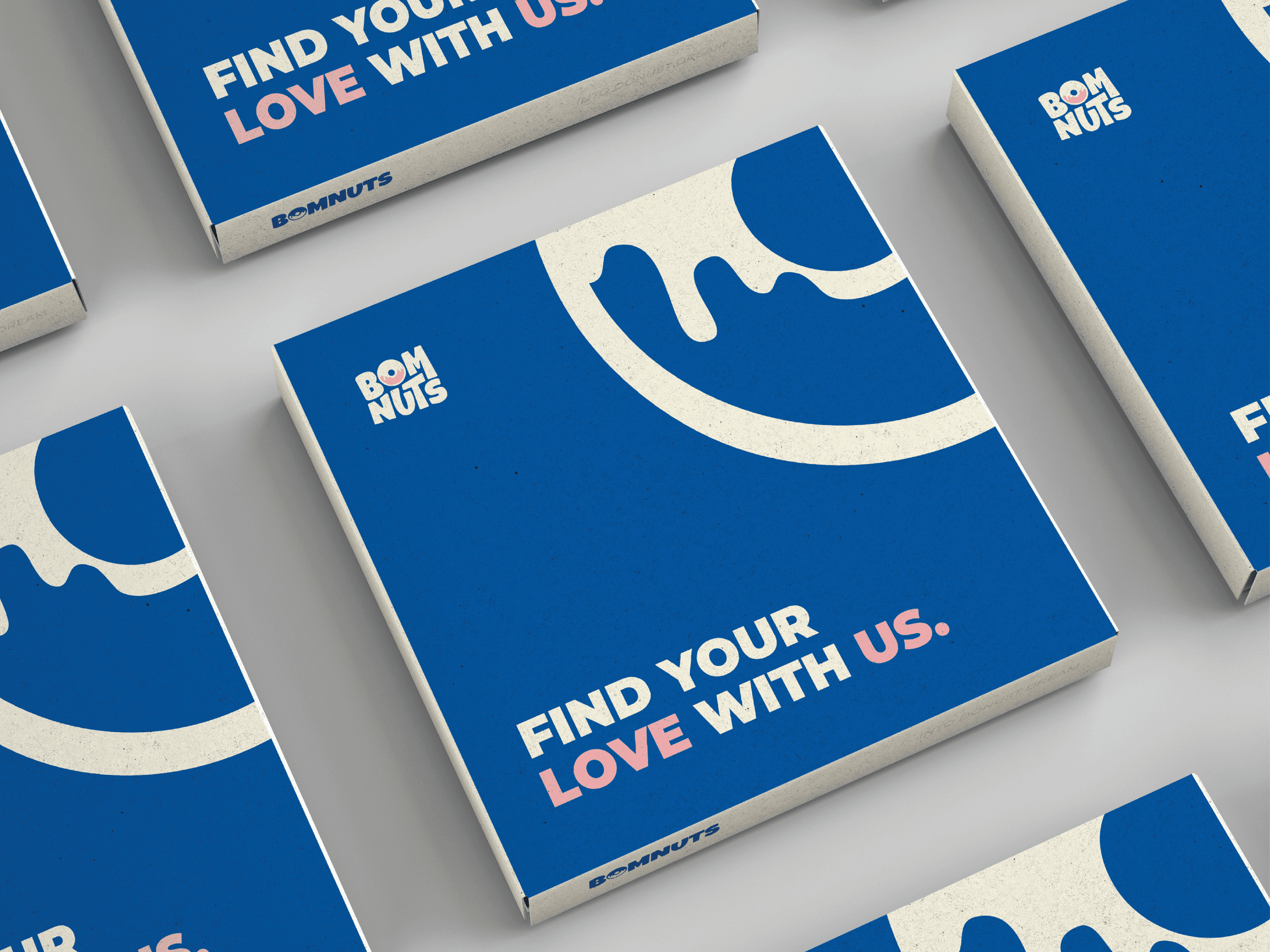
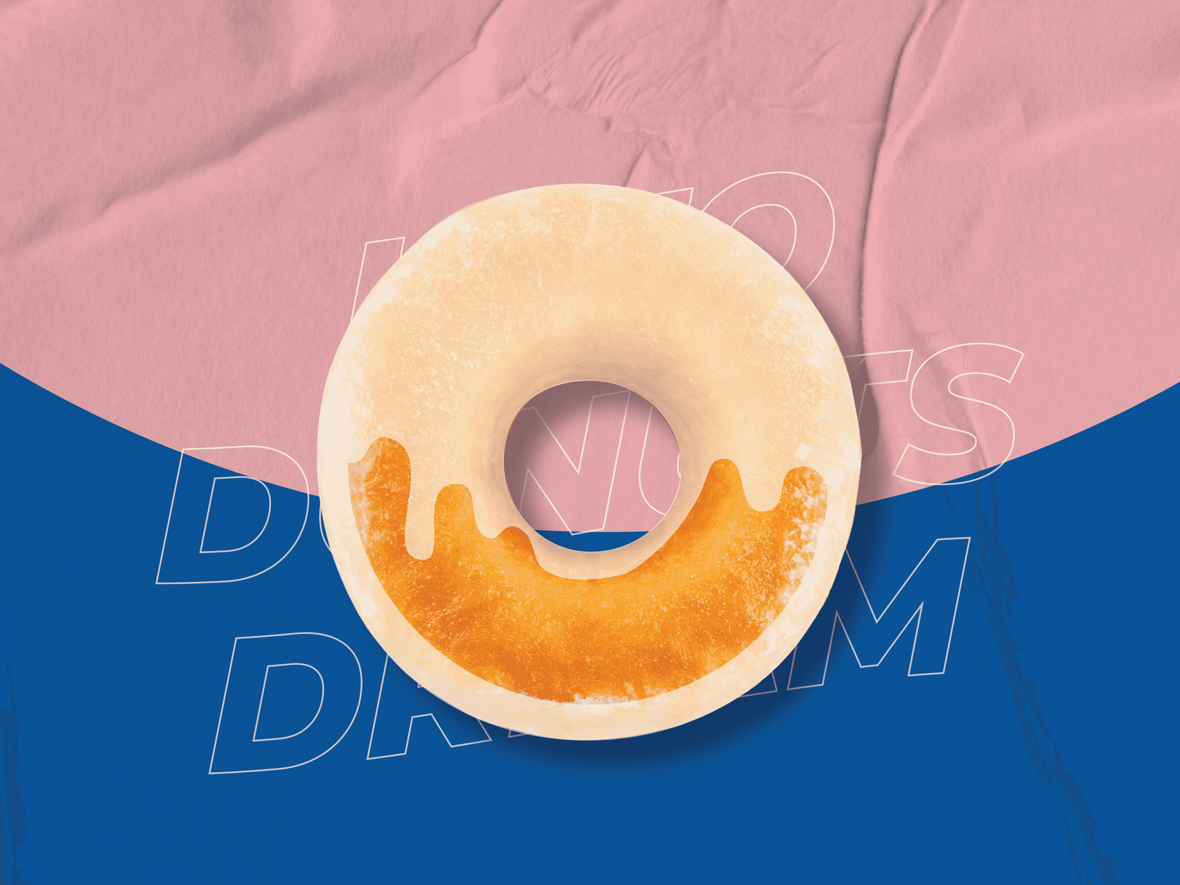
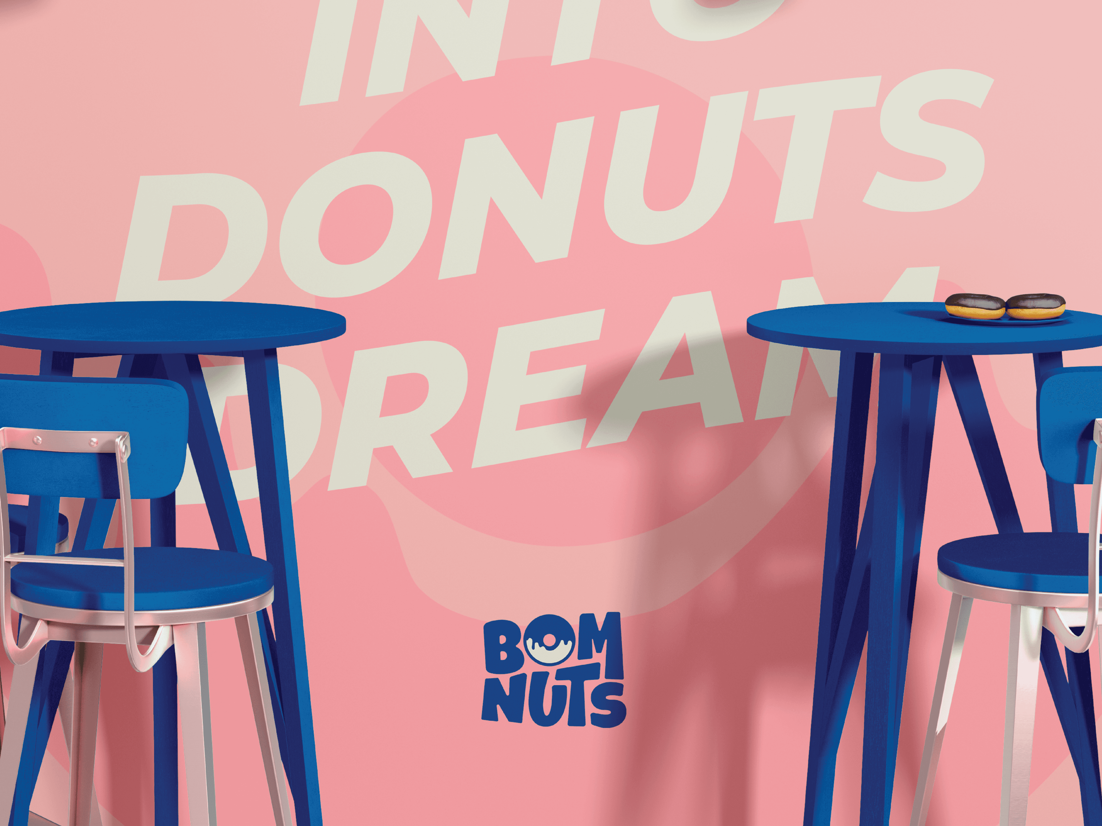
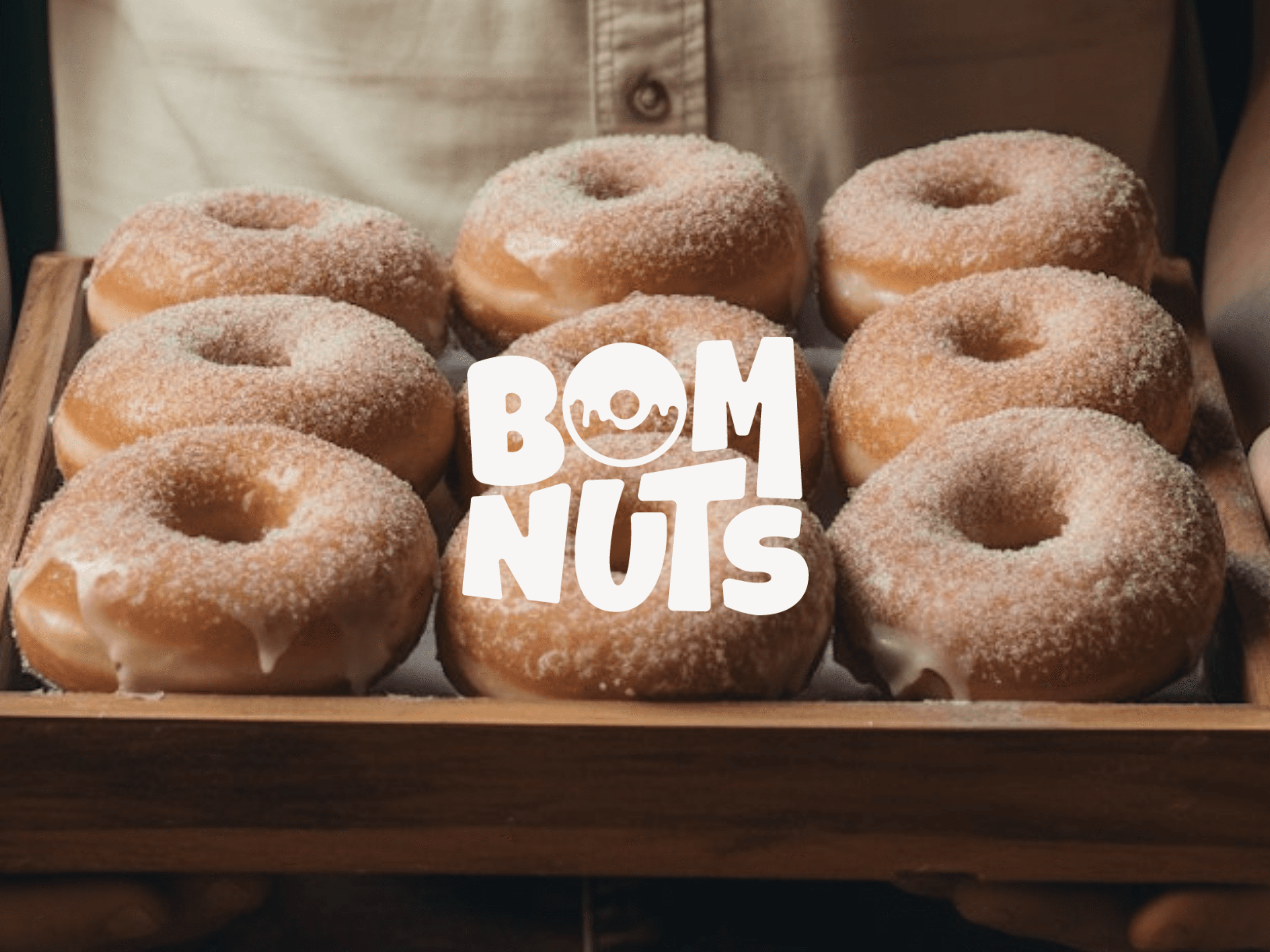
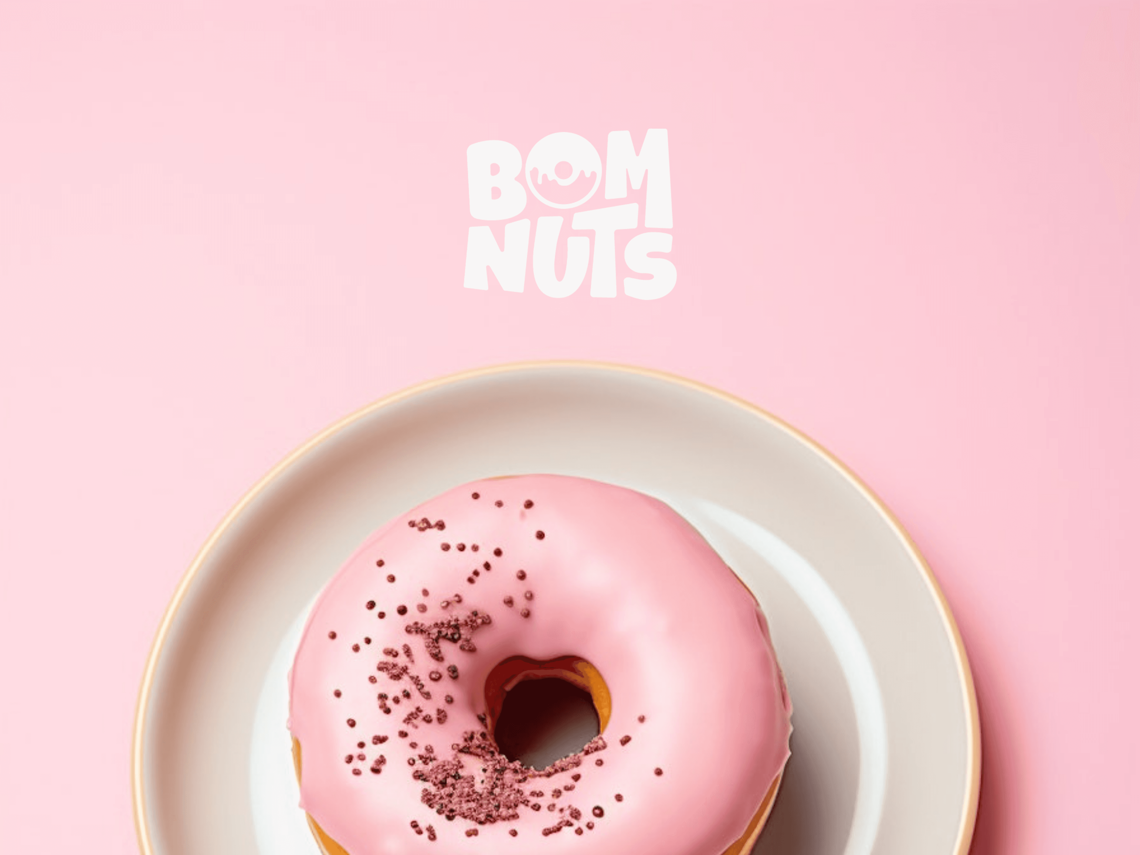
Bomnuts is a fun, indulgent bomboloni (filled donut) brand targeting young, social media-savvy consumers. It needed a bold and playful identity to match the product’s joyful character.
Client:
Bomnuts
Role:
Logo Designer & Playful Brand Stylist
Year:
2022
Challenge
The challenge was to create a logo that visually represented the unique donut style while feeling vibrant and modern. It also had to work across packaging, merch, and social platforms.
Objective
To design a logo where the letter "O" became the bomboloni icon, paired with a playful color scheme of blue, pink, and broken white. The typeface had to feel friendly yet clean.
Results
The final logo instantly communicated fun and flavor. It helped Bomnuts stand out in a crowded F&B market and supported strong engagement both online and at point-of-sale.