Aromatherapy
Branding Packaging Design
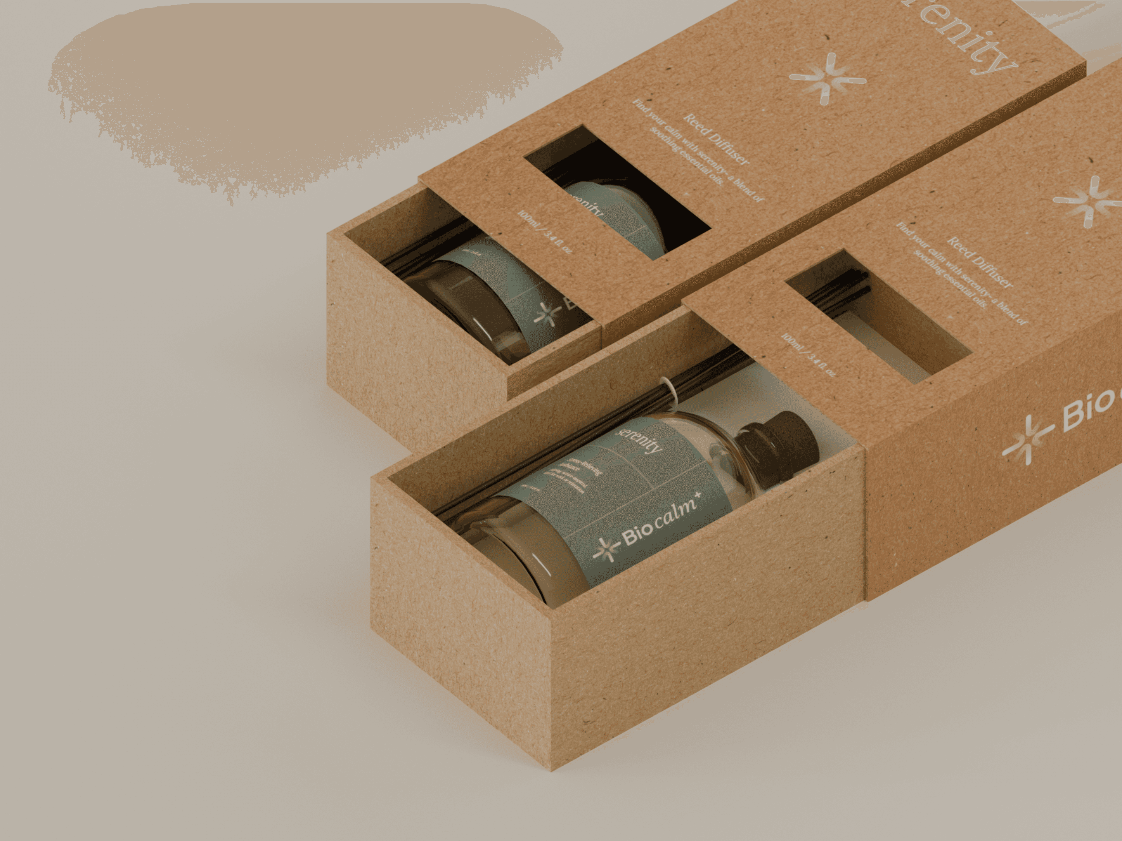
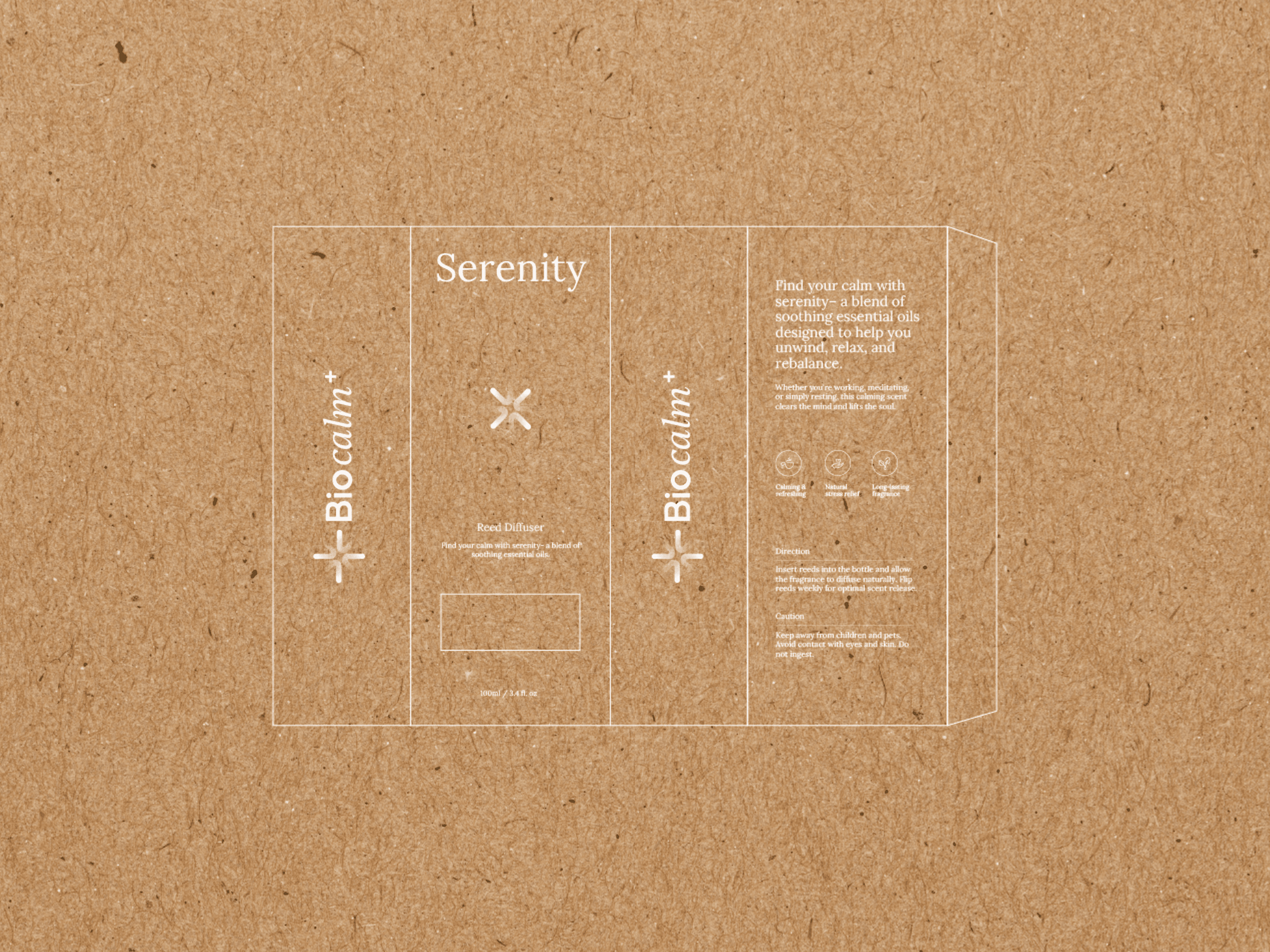
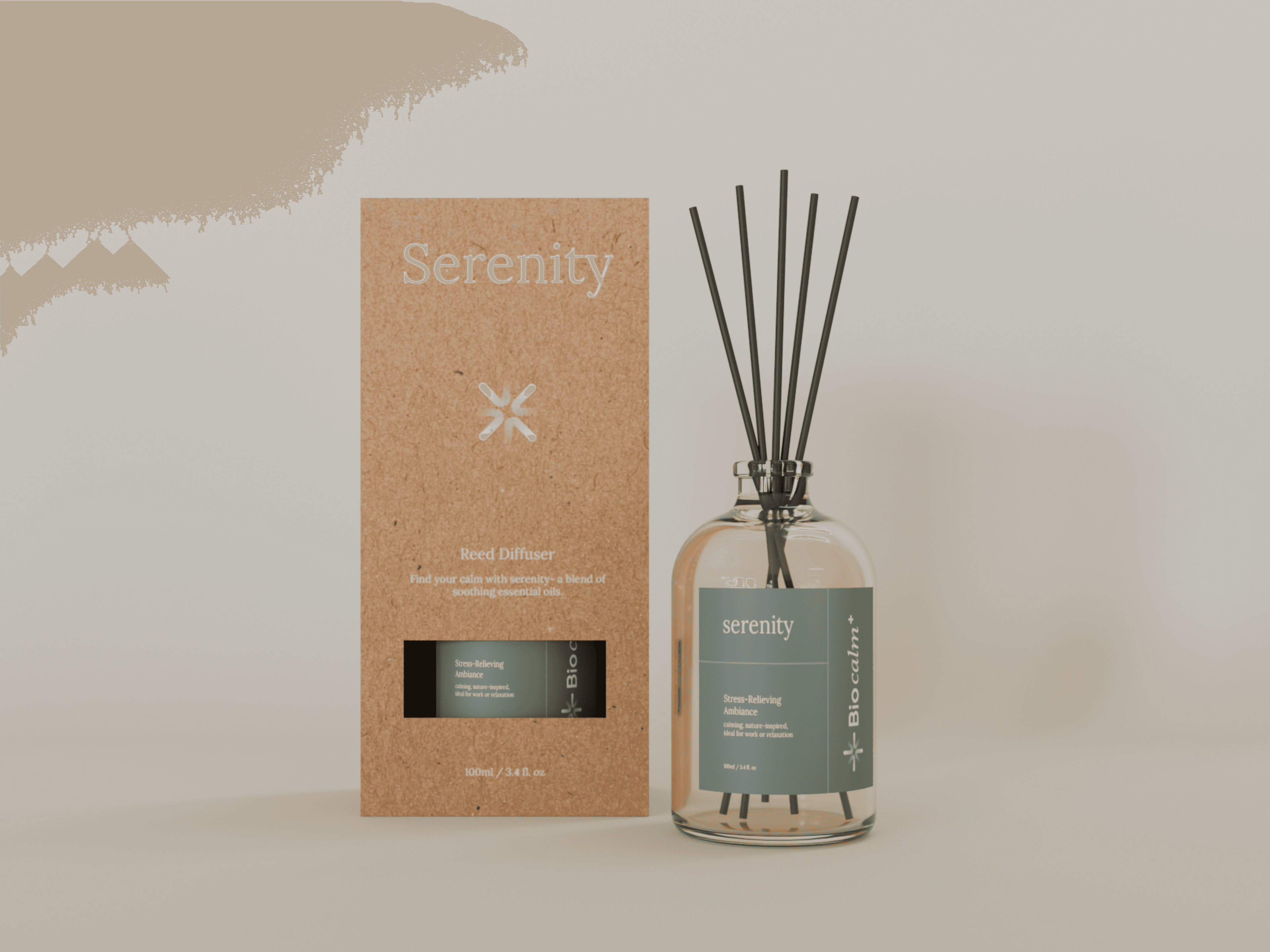
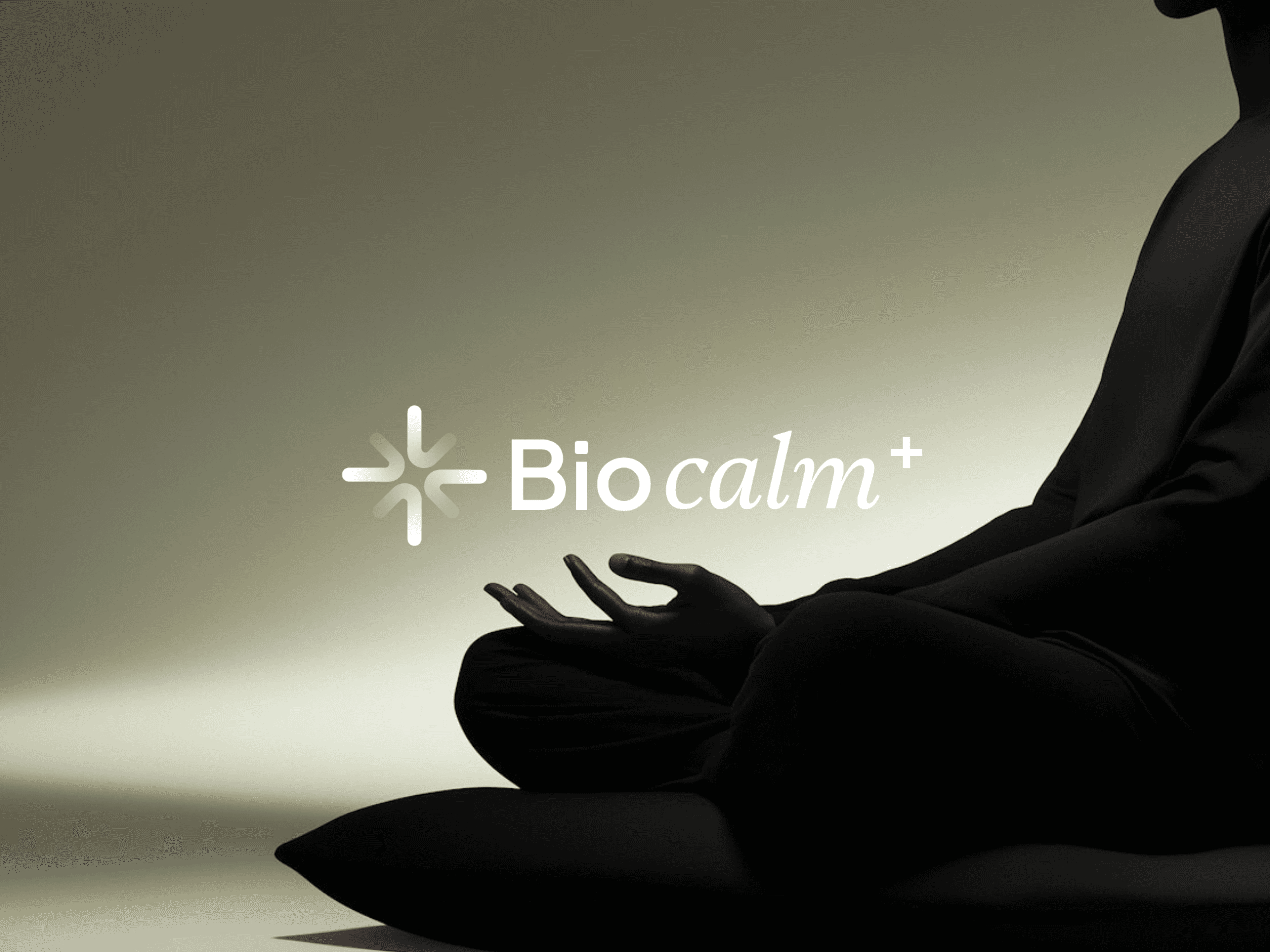
Bio Calm+ is a wellness product line offering calming solutions like diffusers and inhalers. As a sister brand to Bio Life, it required consistent visual language with distinct product identity.
Client:
Bio Calm +
Role:
Brand & Packaging Designer
Year:
2025
Challenge
The brand needed packaging that was calm, premium, and category-specific. The design had to work across multiple SKUs with clarity and aesthetic appeal.
Objective
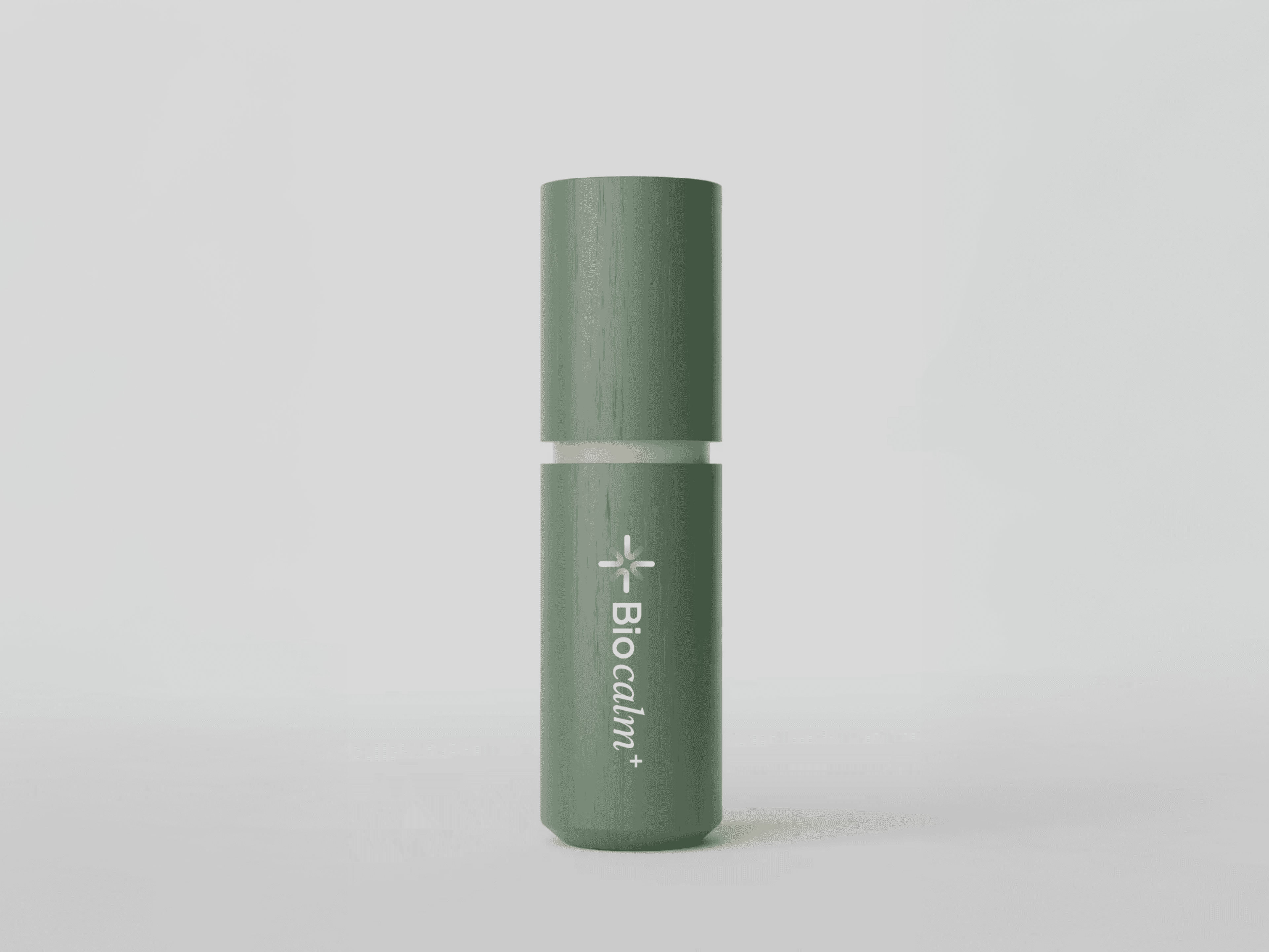
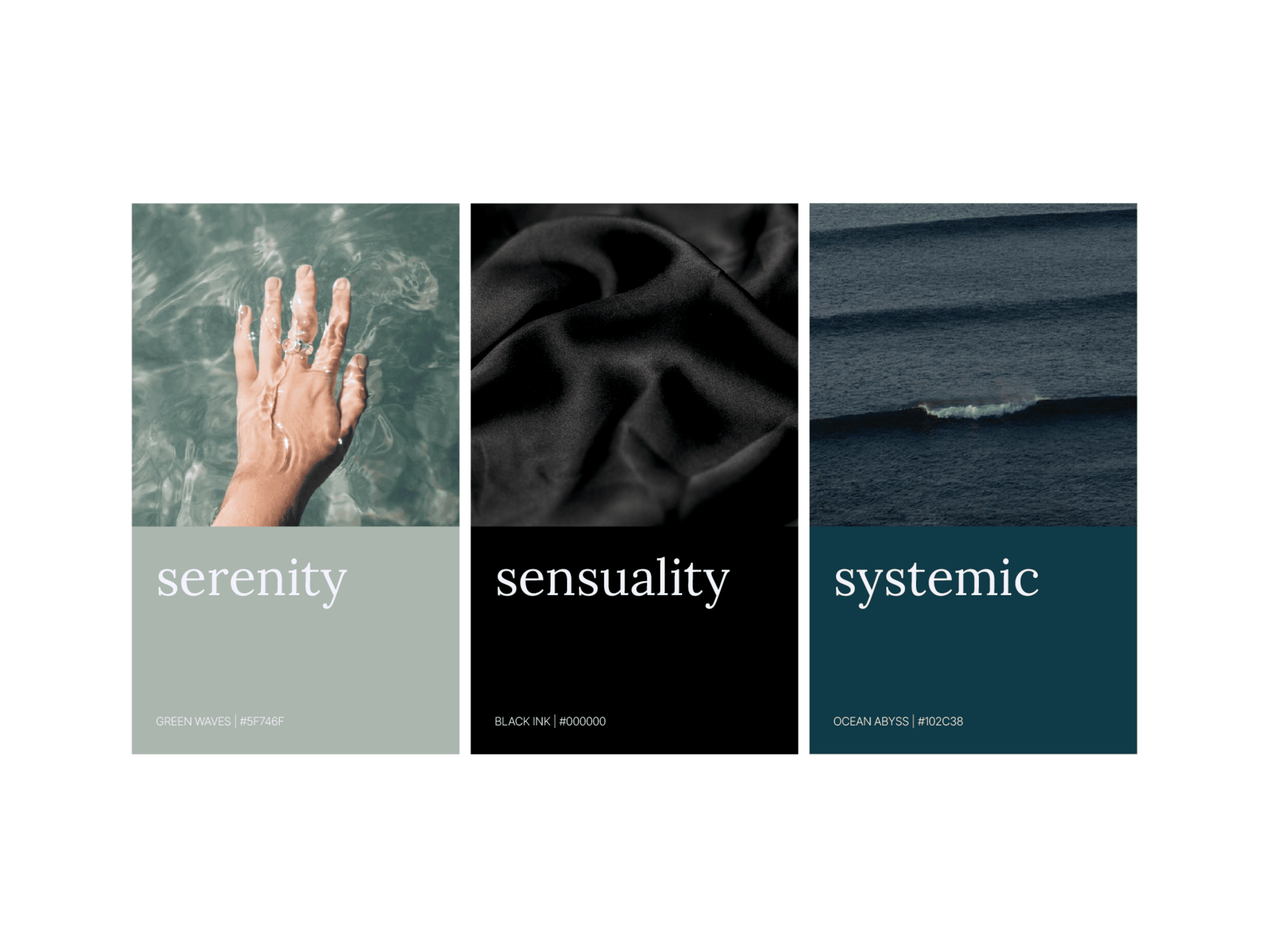
To extend the Bio Life branding with a new monogram and product line. The packaging was developed using kraft paper with white text, and sticker colors to represent three product categories: Serenity (Light Green), Sensuality (Black), and Systemic (Blue Ocean).
Results
The design system created strong shelf presence and made each product easy to identify. The calming visuals elevated the product experience, while consistent branding reinforced customer trust.